The Windshield Wiper, a short film from Alberto Mieglo won an Oscar for Animated short in 2022, and was published for view on YouTube that same year. I only just found this out. Apologies.
The Windshield Wiper in Full
The Windshield Wiper — 2021
The Windshield Wiper — 2021
The Windshield Wiper, a short film from Alberto Mieglo won an Oscar for Animated short in 2022, and was published for view on YouTube that same year. I only just found this out. Apologies.

Some inspiring words from Maurice Sendak — reflecting on aging, beauty, life and death
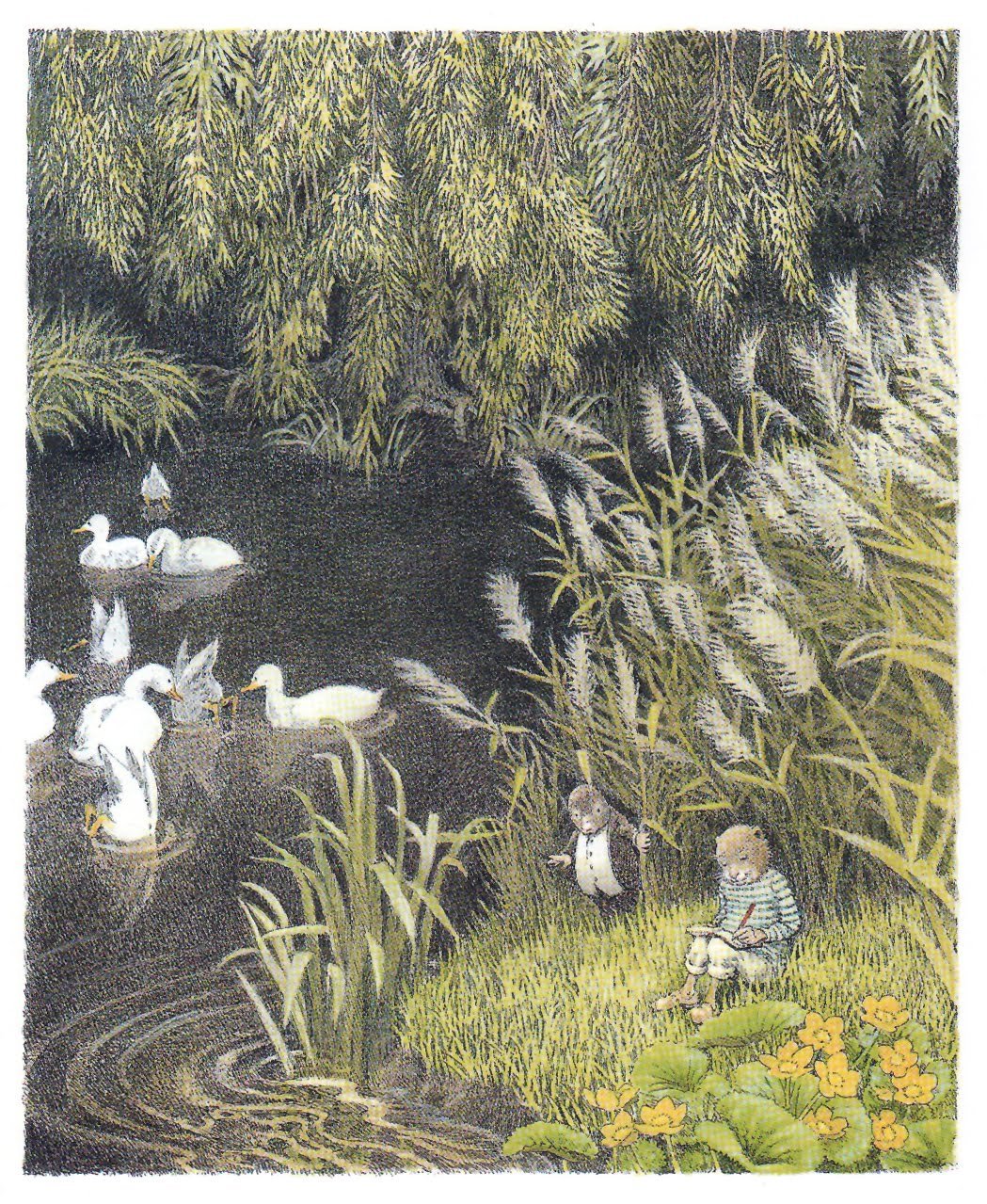
Inga Moore — 1999
The Wind in the Willows is classic book, with some incredible illustrations in various editions. Wholesome and cozy a delightful for a century.
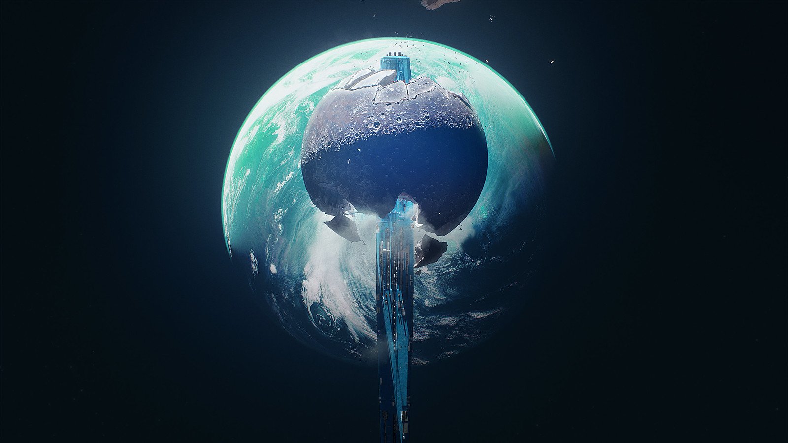
Oh wait, its the Marathon Logo actually
Bungie release a teaser trailer for a new project Marathon, a pvp extraction shooter that is bright and stylish and mysterious.

photo Mauren M Evans for Financial Times.
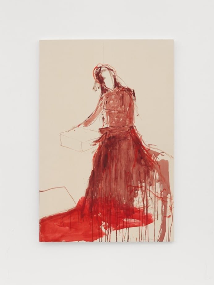
Last week I got to attend an artist talk with Tracey Emin at New York Academy of Art as she was interviewed by writer and critic Jerry Saltz. It was wonderful to see her in person and hear how her life had been affected by cancer, and how she is motivated, a fire under her, to make the most of her remaining productive years.
Read the article here on Isadore&Dunn Gallery.
I’m Here, I’m Alive — Financial Times
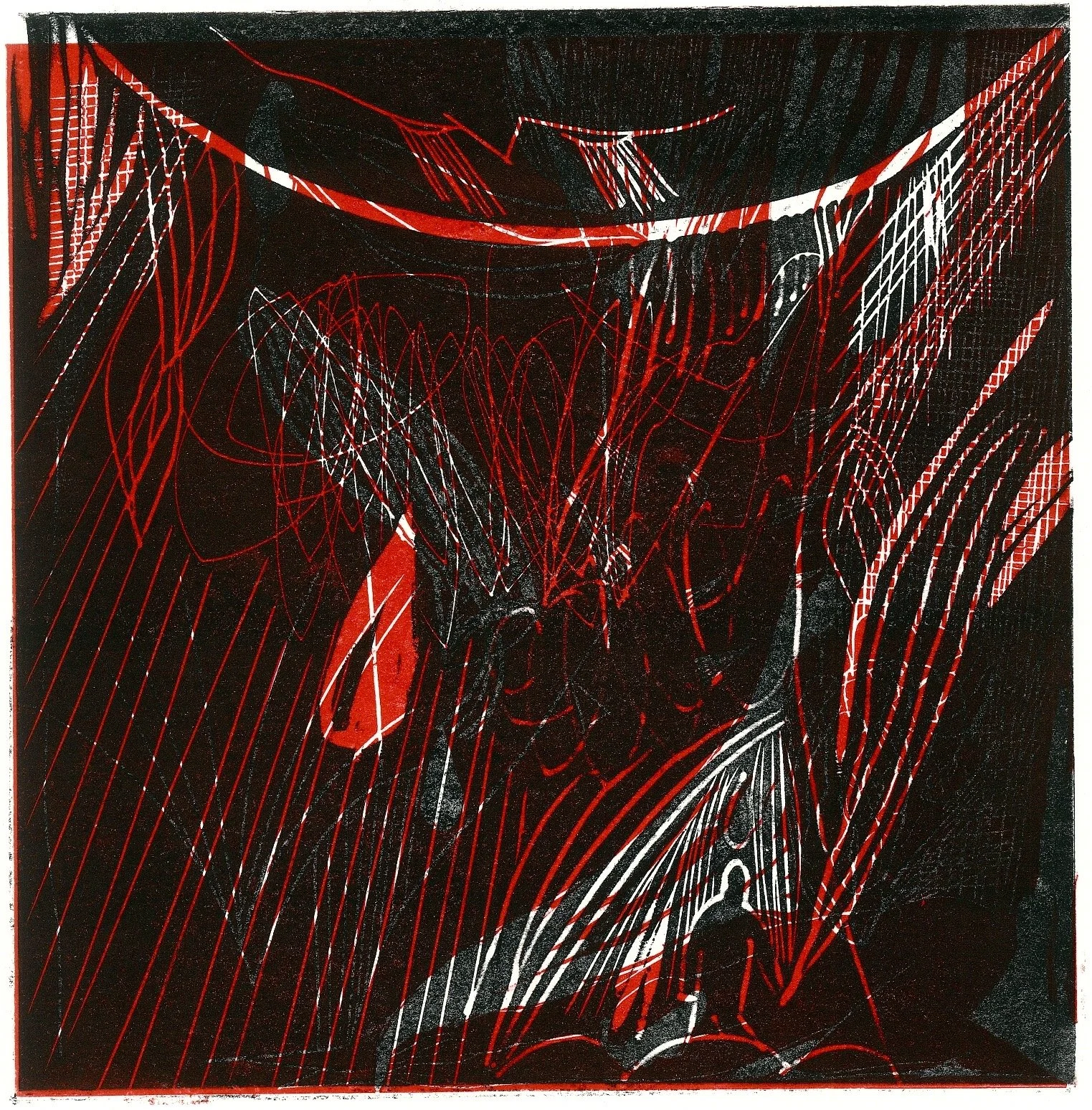
Margo Sarkisova, Black Sun Rising, 2022
Isadore&Dunn Art Gallery, (for whom I am a co-founder) put up a show this season from Margo Sarkisova, an Assyrian artist from Ukraine who has had to deal with life under attack from Russia’s full scale invasion in February. The work reflect the anxiety of an artist whose world is on its head, from a time where her future and her safety were very uncertain.
We thank her for sharing these prints and her experience in the hopes that it sheds more light on the real human experience of living through such a difficult situation.
See the show here.

An appreciation of Mike Mignola. Always a pillar of inspiration for character, form and a graphic striking style
A wonderful execution of a simple premise in this music video from David Bertram

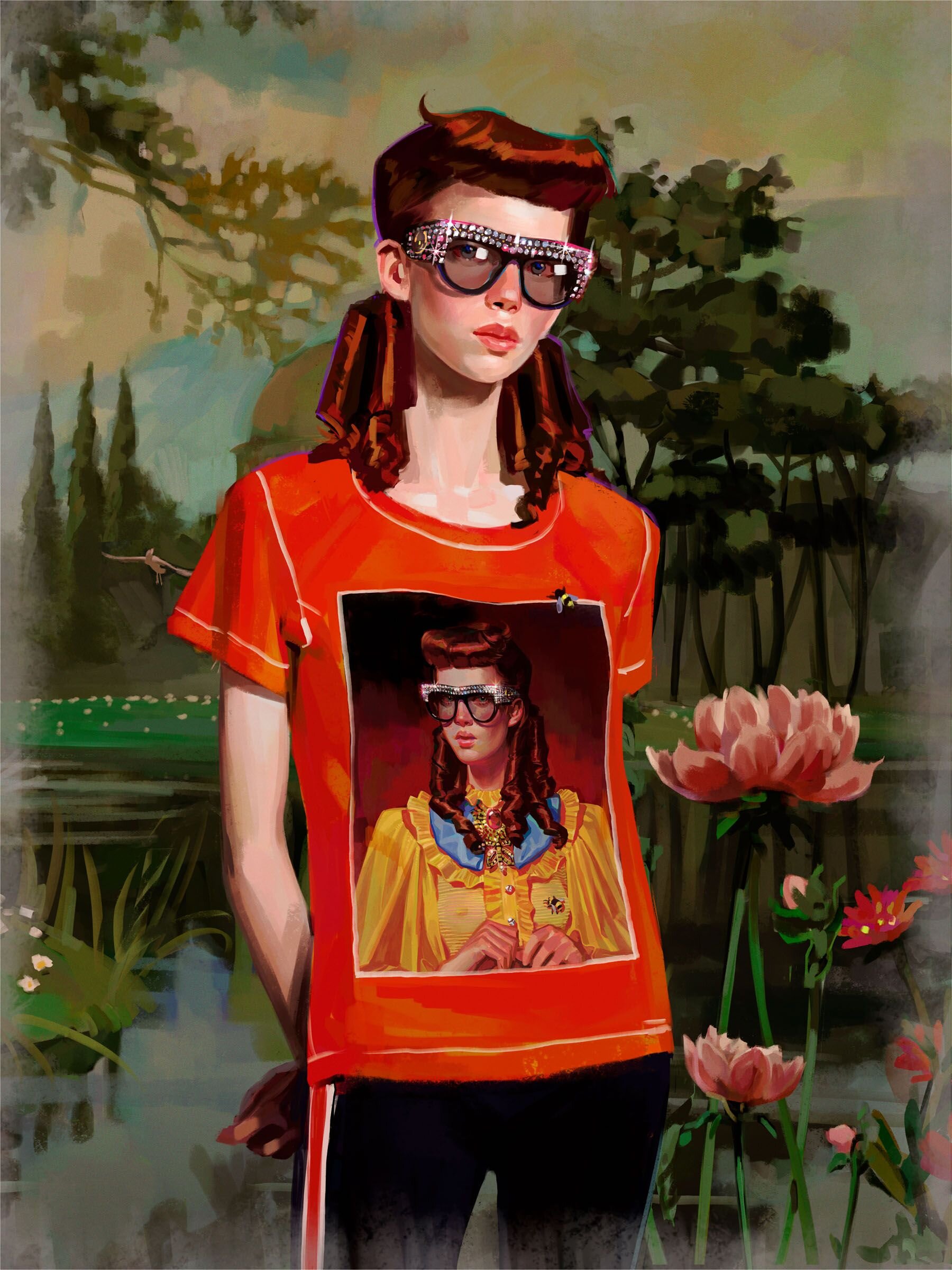
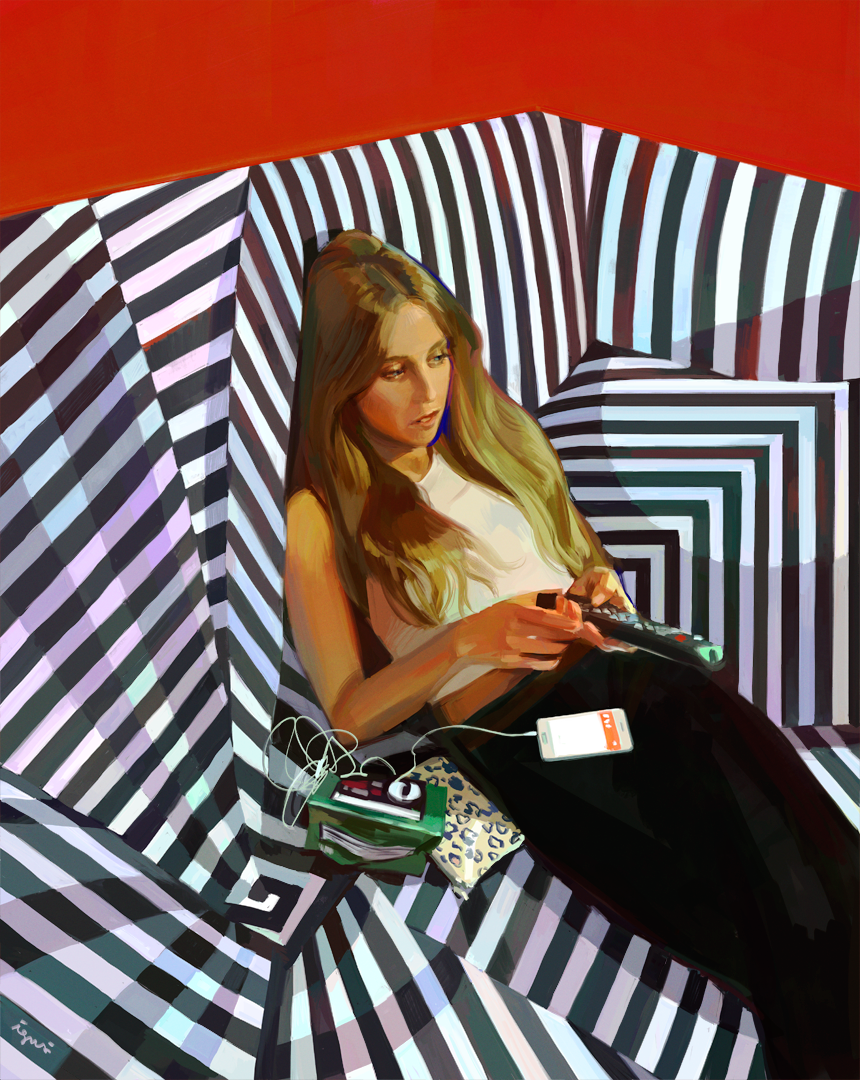
Ignasi Monreal is a Spanish illustrator based in Lisbon, who paints some really inventive and fantastical images that incorporate classic themes and mythology with modern fashion and personal observation.
it seems to be he’s thinking through concepts of beauty and absurdity mostly, recalling Hieronymus Bosch (15th century) or finding the divine (perhaps timeless) beauty in some modern person passed out on a couch, or checking her makeup on public transit. These small moments are elevated and shown in a format we associate with classical painting typically reserved for Gods or Cathedrals. And in a way allows us to imagine that maybe Michelangelo, in painting Gods and Angels and epic scenes, was probably also incorporating current things around himself that he found beautiful or sexy. Bringing this very human touch to the divine world.
Gucci Halucination - Production Company: The Line.

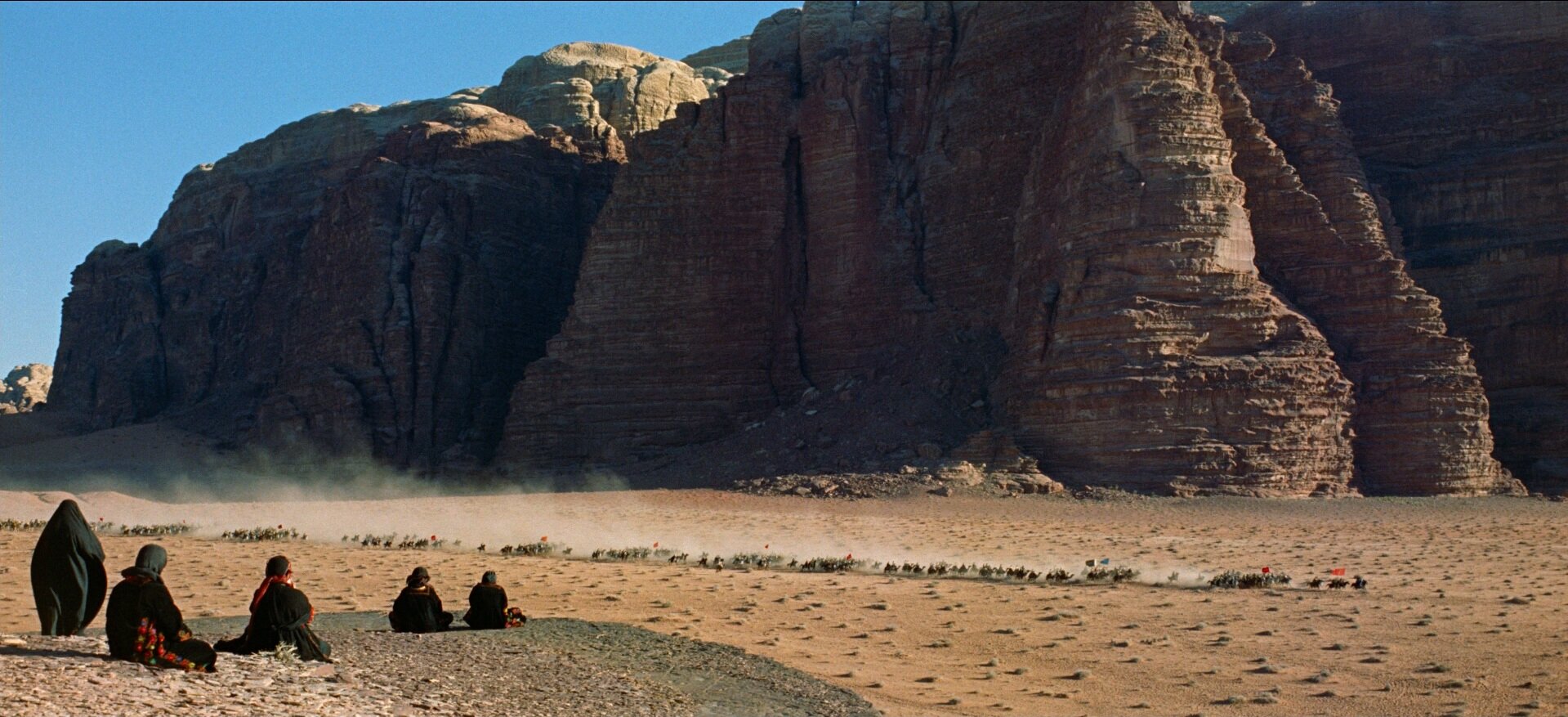
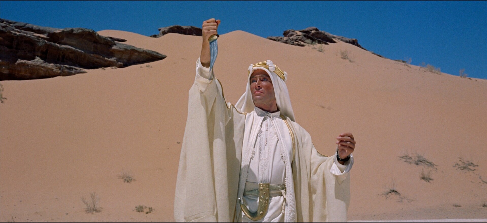
Ahmed Aldoori recently put out a reaction and artist critique video of the recent Dune trailer from Denis Villeneuve. I thought the trailer looked interesting, I hadn’t seen any visuals from this new film yet and I have really loved Villeneuve’s work in the past.
Mr Aldoori had some criticisms, specifically about the use of color in the film grade. He brings up the point that overall the feeling is grey and muted down. And that while this is supposed to be a stark dry desert planet, that doesn’t necessarily mean ‘colorless’. As a counterpoint he shows many examples from the 1962 masterpiece, Lawrence of Arabia. Also in the desert, also stark, also dry. But because of the film stock, and the realities of a real desert location. Colors lighting that could be easily missed by a very green screen-heavy, matte-painted, digital filmmaking process.
He also takes issue with the reluctance current digital filmmakers tend to have at avoiding black and silhouettes. People shoot raw, they have details in the shadows, and theres a tendency to want to keep that information because its there. And also people all down the line from directors and DP’s to post production artists are more used to seeing this footage where even in the blacks, there is detail. And that affects the final grade.
Ahmed talks about blacks, and their use in a composition to lead the eye. As a way of making a photograph bold and graphic.

Ron Cobb, American/Australian illustrator designer and concept artist died on the September 21, in his 80s.
Ron was know most for his work on the ships and logos and iconography in Ridley Scott’s 1979 film Alien. He also worked on Back the the Future, Total Recall, The Abyss, Dark Star, Star Wars…
More information on his life and history here at We Are The Mutants.
Alien is one of the best lived-in-future worlds in all of cinema. It is dingy and rough, old and broken down. Tactile and utilitarian. In addition to the objects and interiors, there is also a very plausible graphic system for the ship indicating various safety warning. These types of symbols exist in a lot of hazardous workplaces and this version looks clean and futuristic, but also looks like it could have been in use at any point from the 40’s onward. They are completely usable and believable.


Cobb served in the Vietnam war and when he returned he got back to work as an artist, creating many gorgeous and brutal political cartoons for the Los Angeles Free Press. They are critical of the government handling poverty, race, the draft, nukes, environmentalism and police brutality. These comics are an amazing time capsule of the anti-war and politically conscious era and are incredibly relevant today. Sadly we haven’t solved really any of these problems.

For 2020, the Sundance Film Festival employed Studio Lowrie to rebrand with these striking and op-art glyphs and typography based branding. Its simple and powerful, and stands out amid the visual noise of Park City during the festvial. As a system it uses a pared down color pallate and is meant to function across a variety of media and applications, and both static and in motion. It also takes cues from four musical pilars: Jazz, Rock, … Italo-Disco.
Looks almost a bit like navajo art or camera test and focus patterns. The Studio themselves mentions the circular shape is referential of film projectors, eyes dilating or contracting, and the sun.
Branding from Studio Lowrie
Typeface La Nord by Raoul Gottschling
Motion by Connor Campbell
More on It’s Nice That.
Sundance Motion Reel – Connor Campbell
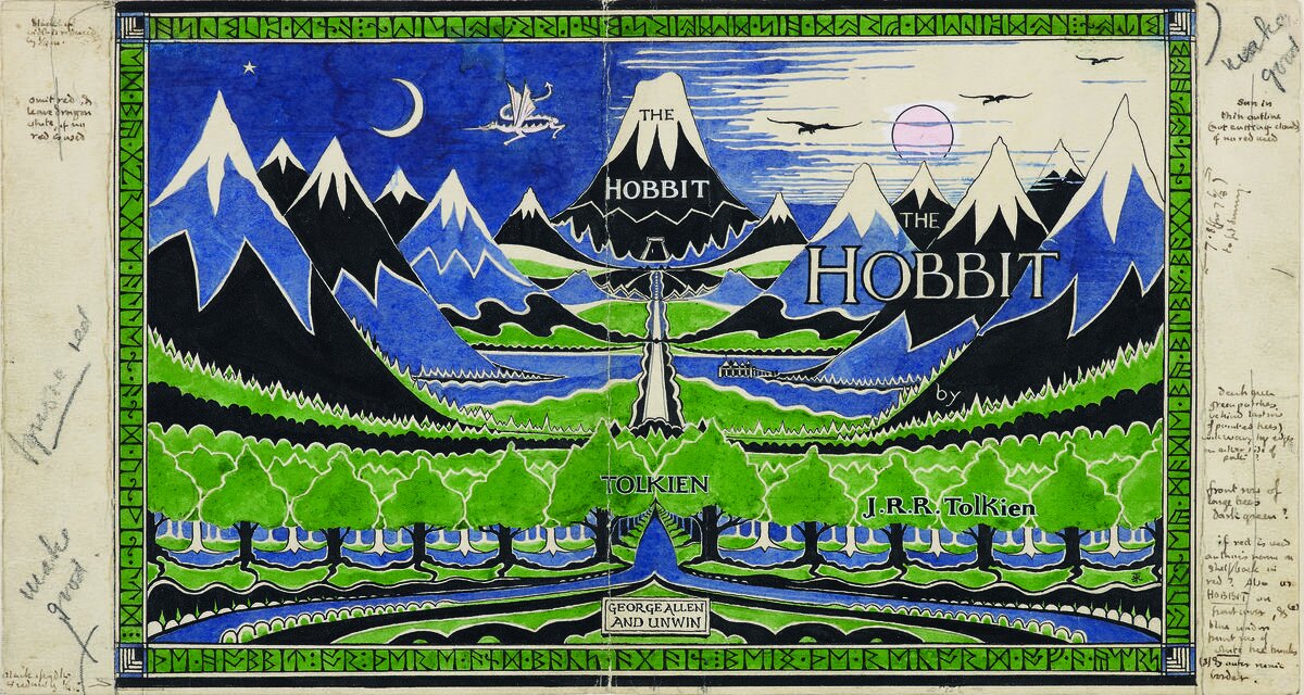
Cor Blok is a Dutch illustrator who made some of the earliest visual interpretations of the Hobbit and Lord of the Rings by JRR Tolkien.

I saw a thread recently on Twitter about how bad the covers for the hobbit were from the mid 90s which lead to loads of people posting covers of LOTR and The Hobbit book art. And so I posted my own experience. The books I had read, my moms copies, were far and away some of the nicest of the lot. These felt whimsical and fun very much in line with Tolkien’s original drawing for the Hobbit and Lord of the Rings.
Barbara Remington illustrated them for the 1965 paperback editions, one of the most widely know editions to that time. She designed them all quickly, without having read the books. And I think they are just wonderful.
Though Ms. Remington regretted being unable to read “The Lord of the Rings” and “The Hobbit” before illustrating them, she was ultimately happy with the way her artwork came out.
“After reading his work, I was in awe of Tolkien,” she said. “I knew there was something special about him. If I read ‘The Lord of the Rings’ first, I don’t think I could have drawn the cover art.”
Barbara also moved to New York City in the early 60’s and was active in the Beat Movement of the time. Extended interview with her at Tolkien Collectors Guide.
Tolkien actually didnt much care for Barbaras work, not understanding what some of the animals (whats that, a lion?) and plants (are those… pumpkins?) being depicted were. And thats too bad, but she hadnt read the book, so, get over it I guess. I Love Barbara’s work, just as I love Cor Blok, who’s depictions were also called out by tolkien for not being accurate, though he did like them. People can make up whatever visuals they like that suit them. Its partly an act of creation in reading, imagining the world you hear described.
Coincidentally, the bad cover from the hobbit in the 90’s? That was the art on the version I read then as well.
Barbara Remington Obitutary — New York Times

Barbara Remington illustrated Map of Middle Earth in the same style and with many of the same elements as the 1965 paperback cover.
Michael Herring illustrated 90s covers. The ‘bad’ covers mentioned above. Its too bad, the rendering quality is nice, they just seem a bit hokey compared to the graphic colorful 1965 version or Tolkien’s own drawings which are cute and a bit naive.